
The UnmakingAmazon Game Studios | 2014
Overview
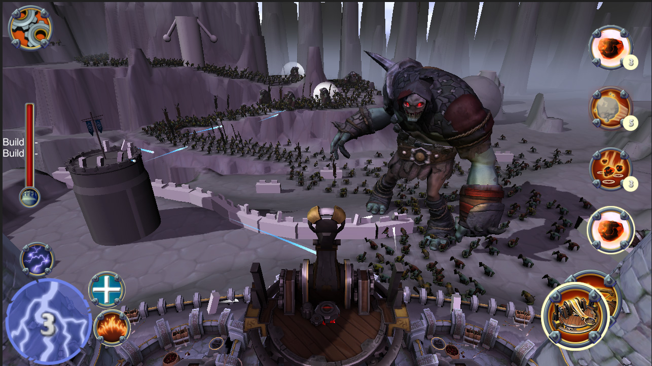
The Unmaking was developed to showcase Amazon’s AppStream service by streaming cloud rendered high definition, PC quality graphics to a tablet device. In this game, the player defends their castle against “waves” of massive enemy hordes. With touch-based controls, you command various mounted weapons, dragging your finger to aim your shots out from the castle wall.
Platform Kindle Fire
Tools Unity/C# Maya, Photoshop
Skills Design, Prototyping, Scripting, Environmental and Enemy Design, UX Design
My Role
My primary responsibilities were as the team’s Sr. Designer, prototyping player input, AI, game mechanics, and play interactions. In production, I moved to designing and building all of the layouts, scripting, and configuring play. I also did early enemy prototyping and collaborated with UX on controls and player feedback systems.
Challenges
- Cloud rendered gameplay created limitation on controls and gameplay feedback. The technology performs best when camera remains fixed. Additionally, the control input is done locally and sent to the server so control feedback (like projected UI about where a shot might land) proved difficult.
- High volumes (hundreds) of enemies onscreen meant having very basic and fragile AI calculations which could be completely rerouted by even the smallest level design change. (moving a single unit of terrain could change and entire battle)
- Balancing cognitive load and combat pacing would prove difficult due to high volumes of enemies
- An aggressive schedule didn’t allow for very much iteration or bake time.
Early Prototypes
Below are my initial explorations into play/combat mechanics as well as populating the scenes with high volumes of characters.
Following a week of prototyping, we would gather feedback and combine the most promising ideas into a playable prototype.
State Machines: The first prototype involved setting up some basic state machines and spawn patterns for instancing enemies and their attacks.
HUD /Damage: I also wrote additional code for HUD and in-game damage indicators so we could tell which enemies were doing the most damage.
Much of this prototype code would be reused and extended throughout the project.
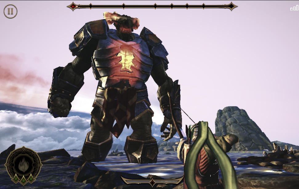
Prototype – Vomitous
One of the challenges with The Unmaking was achieving the element of surprise. Enemy exposition was generally limited to spawning out of sight or at great distances. We could “magically” spawn enemies closer to the player, but it often felt “cheap” or unfair to do so. Enter the “Vomitous”…
Testing an idea for a large, physical enemy creature that “vomits” other creatures onto the battlefield. Its initial appearance was meant to provide a very memorable and intense moment while potentially giving some back story as to where these creatures were coming from. Initially, a Vomitous could be shot and forced to retreat. Once the player became stronger they could be taken down much sooner, enforcing the sense of player progress.
Developing Play: Enemy Pathing
To handle the volumes of enemies required and remain performant, enemy pathing was implemented as basic A*. This meant that enemies would always find the shortest, most direct route to the player. This presented some significant design challenges.
Problems
- Difficult to “read” enemies moving in the Z-plane, directly toward the player.
- Player’s would fatigue early, reporting that play quickly become boring.
- AI was “fragile”, meaning that the slightest change to a level layout could drastically change enemy pathing
Solutions
- Worked with a developer to visualize the enemy navigation. The ability to see what was happening was critical in developing predictable battles.
- Requested the ability to “turn on/off” parts of the navigation grid via script. This allowed me to created dynamic play surfaces and change the enemy flow in response to player interactions.

Visualizing the navigation grid greatly improved the ability to design predictable and more interesting levels.
The ability to script the navigation gird enabled more dynamic play, like breakable walls that could re-route the AI.
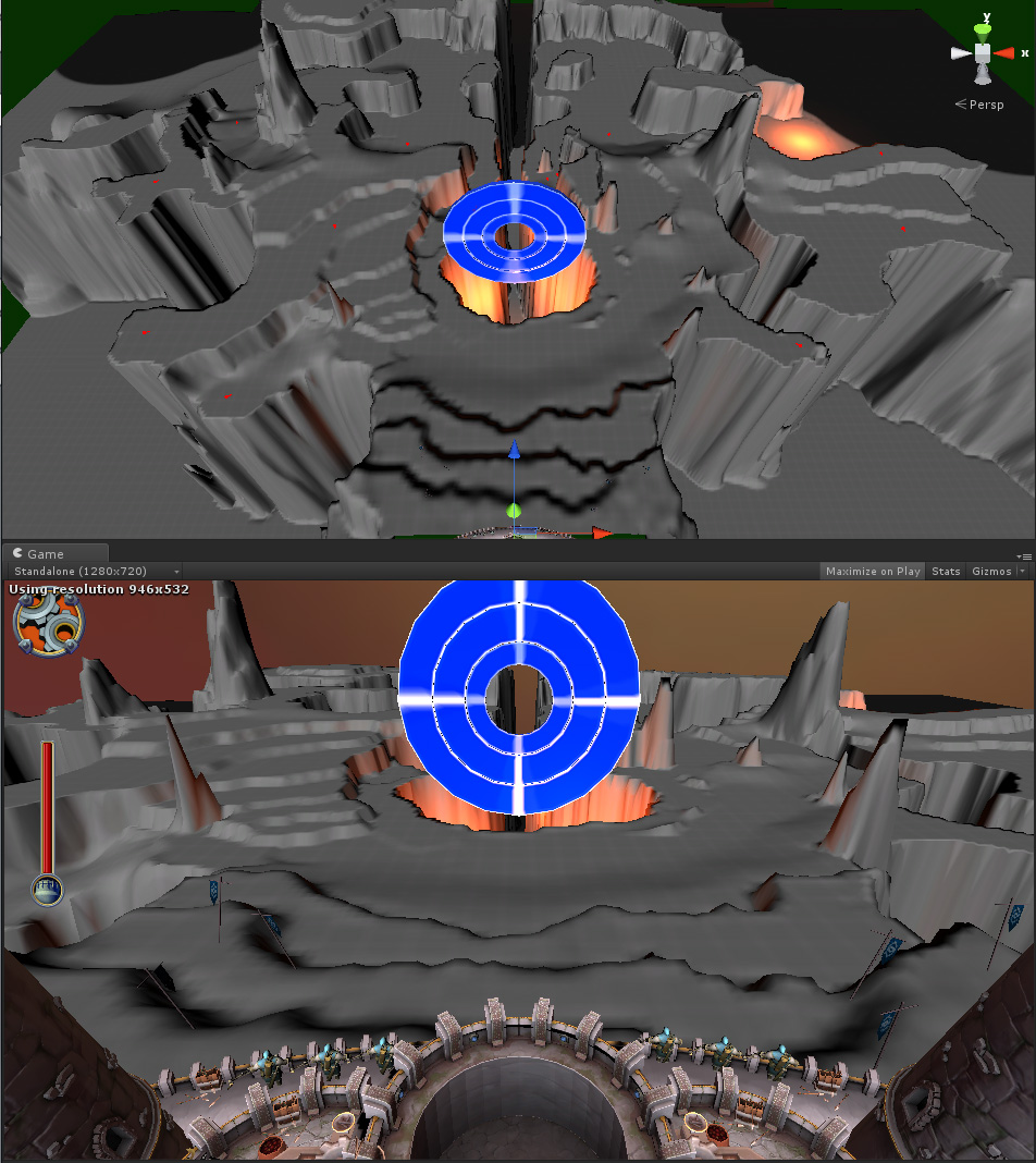
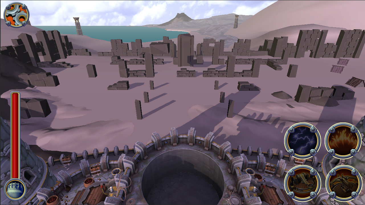
Building the Game – Grey Boxing
Below are my early grey box versions for each level that went into testing.
In order to create deliberate terrain structures, I mapped the gray scale values from Unity’s heightmap to Photoshop. This enabled me to leverage Photoshop’s tool suite to create more interesting maps, much more quickly and predictably than using a terrain editor.

Black Forest
A dominant center line. Small enemies filter through he trees while larger enemies topple them like dominoes. Pathing calculations proved troublesome and this level was cut.
Level_02 – Switchback
A continuation of the forest, this level maintained its switchback motif and made it into the game after leveling the forest in the background.

Level_04
A large backfield game players time to plan. A steep ascent made enemies appear to disappear and pop up right in front of you.

Level_05 – Initial
This level is almost unrecognizable but its intent is clearly preserved. A large area with vertical obstructions provided cover for enemies.

Level_05 – Revision
Large center spires were replaced with thematically correct pillars. The large central arena was preserved.

Level_06
Some of the land bridges were replaced by destructible stone bridges. This level was among the lease altered from its grey box.

Level_06 – Top Down
A view of the pathing required to build a variety of combat scenarios. An overhead view was considered for the game, but was cut due to performance issues.
Level_07 – Finale
An editor view showing the complexity of the heightmap. Some paths are obscured by the central puzzle element, giving players intermittent sight lines.
User Research / Behavioral Science
Qualitative research began early in the project with groups of experienced tablet gamers ranging from ages 18-32 and consisting of primarily male participants. KPI’s were based on the PENS model and included ratings for Competency, Autonomy, and Relatedness.
|
|
Usability Blockers |
Initial Engagement |
|
|
|
Word-of-Mouth Virality |
Overall Quality |
|
|
|
|
NEED SATISFACTION Sustained Engagement |
|
|
|
|
|
KPI |
SUS |
PI |
Autonomy |
Competence |
Relatedness |
Recommend |
Stars |
|
|
n |
n |
n |
n |
n |
n |
n |
|
Rating |
67.0 |
69.7 |
55.9 |
60.2 |
48.0 |
62.7 |
2.7 |
|
AGS Target |
[75-100] |
[70-100] |
[80-100] |
[80-100] |
[80-100] |
[85-100] |
[3.75-5.0] |
Competency: The intrinsic need to feel effective in what we are doing. (Feeling ineffective has a negative psychological impact).
Autonomy: The experience of volition or choice in one’s actions. (does not include forced choices).
Relatedness: Intrinsic desire to connect with others in ways that feels authentic and supportive.
Goal: Improve Competency
Initial testing revealed that scored for competency were particularly low for similar games in this genre. Players mentioned things like “too repetitive” and having “trouble with the controls”. Issues with cognitive load were also observed and players expressed a sense of being overwhelmed.\
Input / Controls
My first goal was to address the player controls. The early build used the Angry Bird’s “Slingshot” where the player taps on the weapon, drags back, aims, and then releases to fire the shot. But our game was in 3D space…
- Too many steps to fire a shot: 1. Tap Screen, 2. Pull back, 3. Aim, 4. Release to fire
- Aiming was inverted. In order to aim right, the finger would be moved to the left, moving up aimed down. (to support the “slingshot” paradigm)
- The “Slingshot” mechanic required players to place their finger in front of the weapon, toward the center of the screen in order to have room to “pull back”. This effectively blocked their view of the action, forcing them to visually reacquire their target.
- Players were unable to use their thumb to control the game, being forced to cradle the device with one hand and use a finger on the other hand to interact
- Cognitive load was likely increased due to poor controls
Solution
I quickly prototyped a new control scheme and gathered first impressions from the team, stakeholders, and new players around the office. In all cases, players found that the new controls were immediately intuitive and easy to use.
- Implemented a “ghost” stick input, allowing player to use their thumb anywhere on the screen to aim and fire (UI element placed on lower left or right) Player’s could now hold the device with both hands and use their thumbs to interact
- Fewer Steps Required – Removed “pull back” interaction, reducing input actions from 4 down to 3 steps: 1.Tap, 2. Aim, 3. Release to fire
- Aiming was direct. Moving left or right aimed left or right, moving up or down aimed up or down.
- Unobstructed view of the action – Removing the need to pull back the “slingshot” and allowing thumb input made viewing the action easier
Results
- Competency Increased significantly from 60.2 to 71.0 which was still below our target, but a big step in the right direction
- Improvement in all scores, bringing Usability and Initial Engagement and Overall Quality within launch values
-
Autonomy increased slightly, possibly because players could now see their targets more clearly when using their weapons
- Cognitive load was improved but still remained a concern (I’d later solve this with a simple AI pathing solution)
|
|
Usability Blockers |
Initial Engagement |
|
|
|
Word-of-Mouth Virality |
Overall Quality |
|
|
|
|
NEED SATISFACTION Sustained Engagement |
|
|
|
|
|
KPI |
SUS |
PI |
Autonomy |
Competence |
Relatedness |
Recommend |
Stars |
|
|
n |
n |
n |
n |
n |
n |
n |
|
Rating |
69.5 |
75.0 |
62.4 |
71.0 |
49.5 |
69.9 |
3.8 |
|
AGS Hero Target |
[70-100] |
[70-100] |
[80-100] |
[80-100] |
[80-100] |
[85-100] |
[3.75-5.0] |

Building the Experience: Level Design
Designing for a stationary player can be quite challenging. It was helpful to think of the experience as if the level was coming toward you and apply some of the same FPS concepts. How do we prioritize threats and make meaningful choices? What kinds of expositions can we leverage to bring enemies into play? What types of cues can we use to grab the player’s attention or lead their eye?

Level One – Introduction
Destructible environment to crush and reroute enemies. Explosive barrels tossed into scene to help the player.

Level Two – Switchback
Switchback provides lateral movement for improved targeting. Large enemies behind the switchback are vulnerable to head shots.

Level Three – The Bowl
A bowl-like layout supports a large, physics based boulder weapon. Play the sides of the level while leaving flow-control wall structures intact.

Level Four – Archways
The left and right archways allow for surprise attacks. Enemies in the distant center can quickly become a serious threat.

Level Five – Arena
An intense battle arena with a wide open center and numerous hidden openings along the left and right walls.

Level Six – Ravine
Four bridges over a massive ravine. Two bridges are destructible while the ravine allow for surprise attacks by flying enemies.

Level Seven – Finale
Enemy routes change over time, creating a wide variety of attack angles. A central puzzle structure must be destroyed to end the game.
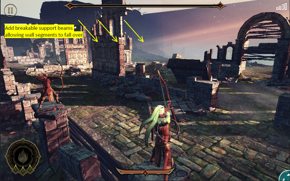
Scripting – Adding Depth
While day and night cycles and weather FX kept the levels visually interesting, I relied on heavily scripted scenarios to keep play interesting and exciting over time. Some techniques included: dynamically changing sight lines, destructible environments that crush enemies and alter the flow of play, shooting exploding objects launched onto the battlefield, and balancing periods of uneasy silence with ambushes and coordinated enemy attacks. Combat was kept fresh by using clever combinations of enemies and leveraging each level’s unique design to full effect.

Making Level One
As is common with designing the “first level” of any game, this level went through more design iterations than any other level in the game. Below is a brief overview of how the first level evolved over time.
Level One – Layout
As the first level, its primary function is to introduce the game’s mechanics in an exciting and engaging way, without overwhelming or frustrating the player. The layout presented above was designed to give the player plenty of time to see enemies coming before they were actually a threat.

Level One – Flow Control
Playtesting revealed that the level was too overwhelming as large numbers of enemies poured into battle from multiple locations. Even though enemies were of a weaker type, the perceived threat was significant. Combined with learning the controls, this proved frustrating for most play testers.
To address these issues, I closed off some wall segments, forcing enemies to take a longer path and funneling them into fewer areas. This gave the player more time to think and target enemies with confidence. I also worked with an AI developer on enemy-only breakable geometry. Areas marked “Blaze” can be broken by larger enemies; shortening the AI pathing to the player. (Larger enemies were removed from the early game and would return in later play, after the player had learned to use their weapon.)

Level One – Experiential Density
Playtesting showed significant improvement in cognitive load after flow control adjustments made in the previous pass. Now, we were in a position to start increasing the difficulty over time, and bring more interactive elements into play. The following changes would occur over several passes, each with more testing and adjusting.
- Add destructible environmental elements (pillars, arches) that the player can target to take out groups of enemies
- Add more waves to combat, each with increasingly difficult enemies, in larger numbers – test to find a maximum cognitive load for new players
- Add exploding barrel launcher. Exploding barrels launched into the scene can be targeted by the player, helping them deal with larger enemies while testing their ability to aim

Level One – Art Pass and Final Stretch
Once the difficulty progression and dynamic environmental elements passed through testing. We were ready to hand the level to the art team. Artists have been involved throughout the entire design process and we all understand how the level is intended to play. This was an important point in case the geometry was accidentally moved during development.
Following an art pass, the level was ready for decorative scripted events, such as large enemy projectiles smashing down your outer walls to reveal the on coming enemies. (these were non-blocking assets) This process continued until the art was finalized and the level was retested.
Shipped: The Unmaking 1.0

Version 2.0 – User Research
After the initial release, I was tasked with delivering a design for a more immersive, and engaging update. To do this, I teamed up with User Research again to determine how our game was performing relative to the the PENS (Player Experience of Need Satisfaction) model.
I then focused the design and aligned the team around increasing PENS scores; specifically Autonomy and Competence, while improving engagement and replay value.
To do this within budget, it was critical to reuse as many assets as possible and within the limits of the current technology.
- No new art assets
- Work within the existing technical limitations (no dynamic camera movement)
The Plan:
- Allow the camera to be repositioned in various parts of each level, creating new vistas and play surfaces within existing layouts
- Implement a basic mission system to improve engagement and give the player clear goals
- Develop scripts that moved the camera based on the completion of various objectives
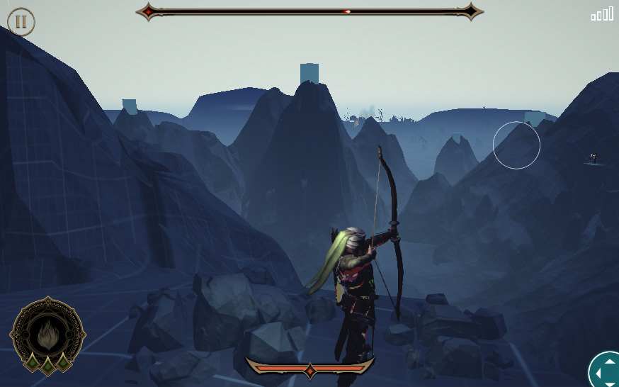
- Establish the player as an Archer (instead of a weapon on a wall) who would fight along side of other archers in scripted combat scenarios
Below is a gallery of mission mockups

Intro Mission
Narrative driven and threatless intro to teach controls

Unique character mission
Allows for dramatic sequences, focused gameplay, and asset reuse
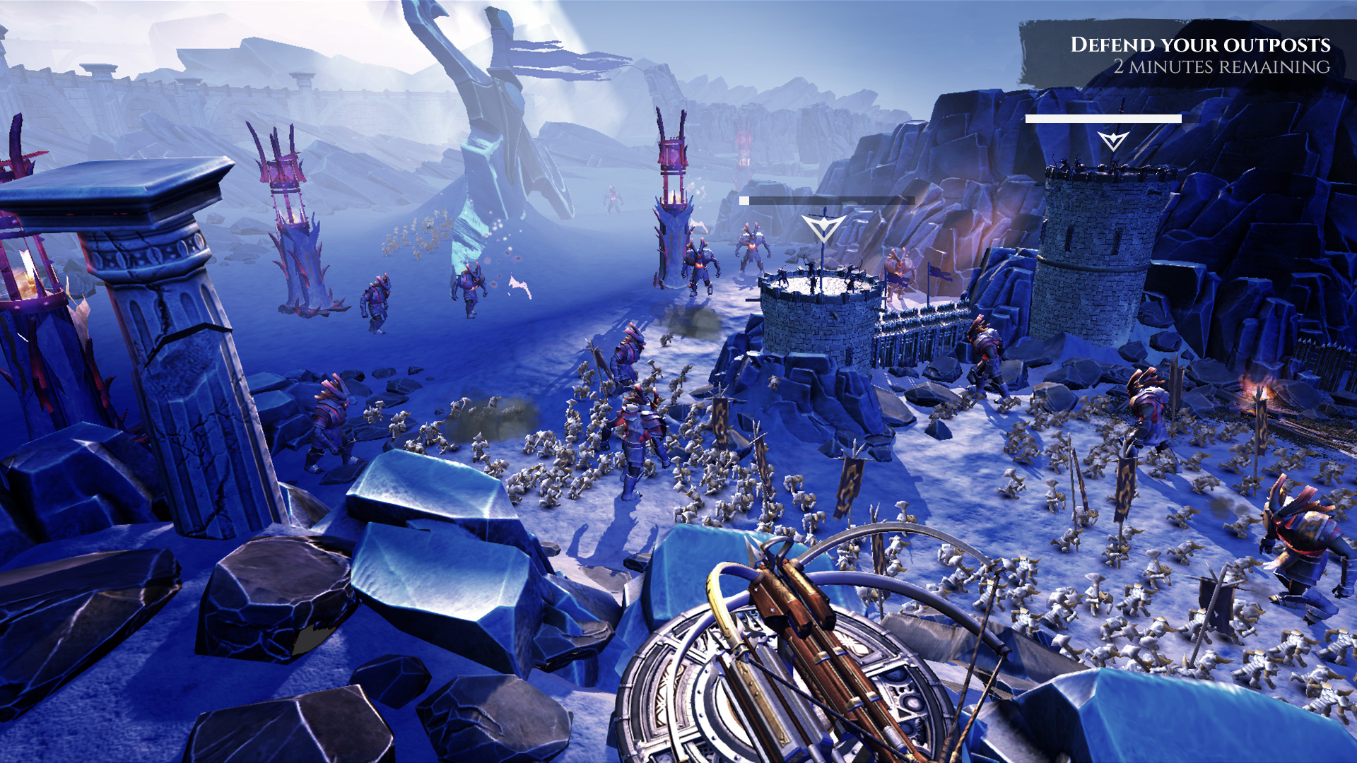
Defense missions
Opens up possibility for alternate positions and goals around the battlefield

Multiple targets mission
Clearly shows progress towards a goal

Kill total missions
Alternate gameplay possibilities open up when sheer quantity is the goal

Kill # of a specific type
Focus on certain targets while surviving against all others
More Dramatic Battles
As an archer on the ground, this scaled up enemy presents a more serious threat.

Unlocking the Level Design
Leveraging the depth of each level’s design by exposing previously unseen areas
Greater Immersion
Experience the level design up close, for a greater dramatic impact and more variety in play. The Pylon level was made to introduce players to their new role as an archer and familiarize them with the new mission.
Light The Pylons – 00:00
Level One Missions – 00:36
Prototype footage lacks proper camera transitions and is condensed to show multiple concepts in a short time.
Moment to Moment
Our design sessions produced a rough play sequence which was used to assemble the first archer mission prototype. Moving forward, we would continue iterating on timing and adding interactions until we felt really good about the overall experience.
Send a Message
Light the pylons to report a massive horde moving through the pass, toward the town.

Defend the Town
First scripted encounter with a “Captain”. These enemies create paths by smashing things, including people.

Fell a Captain
Establish that Captains have many hit points. You’ll have to level up to take them out more quickly.
Find an Ally
Fighting alongside another archer, you take out captains and cut the horde down until…

Fall Back
A huge wave overwhelms the battle field and you must fall back to fight from the wall.

Man the Siege Weapon
A massive projectile slams into the castle, wiping out your allies. Ears ringing, camera wavering, you take control of the massive weapon and end this battle victoriously.
Results
- Goals were posted online, clearly articulated to stakeholders and the team
- Weekly builds were published along with a survey based feedback loop
- Design was highly inclusive and attracted others to participate on the project
- Stakeholders were extremely excited by the demo and planning for production began
- Unfortunately, the direction of the studio would ultimately change and mobile games were no longer a part of the business strategy
- My core team was acknowledged as a positive, highly productive model for future teams within Amazon Games
